This is what we do
FAQ




Making tables and charts accessible doesn't have to be complicated. With the right approach, you can create content that looks good and works for more people.
We invite you to a webinar focusing on one aspect of accessibility work that can be particularly tricky: tables and charts. How do you structure them correctly? What do you need to keep in mind to ensure they’re accessible? And how do you do that without compromising on design?
During the webinar, Monica will share her best tips and provide concrete examples of how you can think differently about tables and charts. Among other things, we’ll look at how labels, heading hierarchies, and other smart techniques can make content more accessible while still allowing the visual presentation to shine.

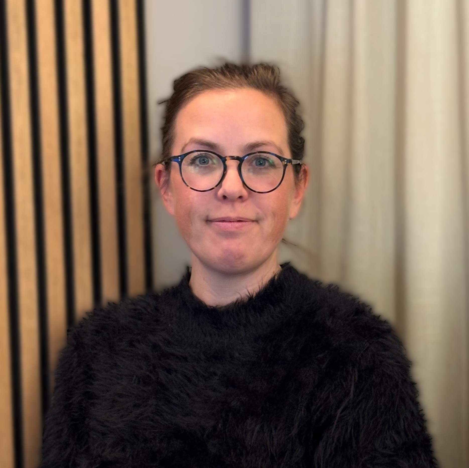
Monica is a designer and accessibility expert at Rehngruppen and has been working here for five years. She conducts training sessions in several areas and has extensive experience with everything from printed reports to advanced Word solutions. With her combination of design and accessibility expertise, she helps our clients create materials that look good, function properly, and are accessible to a wider audience.

Rehngruppen a design and functionality agency that makes it easy to create stylish designs and work smart. We help organizations get more out of their Office tools with well-thought-out templates, designed presentations, clear reports, and solutions that strengthen their graphic profile.
With a focus on form and function, we make everyday life easier for everyone who communicates — from the quickest email to the largest report.